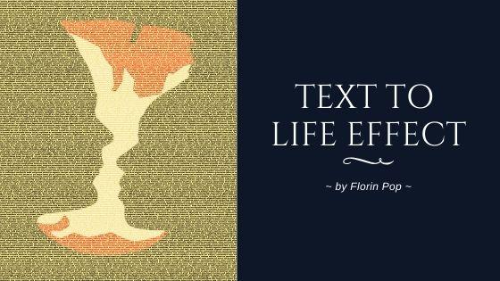
On day #032 of the #100Days100Projects Challenge I saw this effect that my buddy Kyle Shook created and I thought: “Hmm… this would be nice as a project for the challenge”, so… I did it!
In this article I’m going to show you how I did it. 😃
Checkout the final result here:
https://codepen.io/FlorinPop17/pen/eYYdQKz
The HTML
First, we need a looooong text, like: 20,000 words. 😆
The reason we need this long text is because we want the effect to be as crisp as possible so we’re going to decrease the font size a lot, so we need a lot of text to cover the entire screen.
The good thing is that by using Emmet you can type something like: p>lorem20000 and then press: TAB and BOOM! 🔥 You have a paragraph with 20000 words in it! (Emmet is installed by default on VSCode and on CodePen)
Let’s also add a specific class to this p tag so we can target it later in the CSS. At the end you’ll have something like this:
<p class="text-to-life">
	Lorem ipsum dolor sit, amet consectetur adipisicing elit. Distinctio
	recusandae quae natus velit magnam porro autem praesentium explicabo eaque,
	molestias fuga cupiditate, ex nam quasi aliquid non itaque obcaecati eum
	debitis?
	<!-- ... over 20,000 words -->
</p>
The CSS
First, let’s add to the body:
- a nice font (as the default one is ugly 👎)
- a yellow-ish background
- a fixed height
- 0 margin
@import url('https://fonts.googleapis.com/css?family=Montserrat:700&display=swap');

body {
	font-family: 'Montserrat', sans-serif;
	background-color: #f6e58d;
	height: 100vh;
	margin: 0;
}
Next, let’s add some basic styling to our .text-to-life paragraph.
As I mentioned before we need a really small text (5px) in order to make the effect look as crisp as possible. Besides that we’re going to remove the margins, make its width and height full screen and hide the extra content (if any):
.text-to-life {
	font-size: 5px;
	line-height: 5px;
	margin: 0;
	text-align: justify;
	width: 100vw;
	height: 100vh;
	overflow: hidden;
}
Now for the fun part… 🤩
Let’s add a GIF as a background-image, center it, resize it (and all the fun stuff):
.text-to-life {
	background: url('https://media.giphy.com/media/U8mf1vmVzEMmOqU4D8/giphy.gif')
		no-repeat;
	background-size: cover;
	background-position: center;
	background-attachment: fixed;
}
And finally… There are 2 CSS properties left to be added which are responsible for the effect:
- -webkit-background-clip set to text - crops out the text from the background image
- -webkit-text-fill-color set to transparent - sets the color fill text to transparent
There is also this CSS-Trick article which talks about these properties. You can check it out.
Play around with these values to see what other effect you’ll get.
Here is the entire CSS code for this project:
@import url('https://fonts.googleapis.com/css?family=Montserrat:700&display=swap');

body {
	font-family: 'Montserrat', sans-serif;
	background-color: #f6e58d;
	height: 100vh;
	margin: 0;
}

.text-to-life {
	background: url('https://media.giphy.com/media/U8mf1vmVzEMmOqU4D8/giphy.gif')
		no-repeat;
	background-size: cover;
	background-position: center;
	background-attachment: fixed;
	font-size: 5px;
	line-height: 5px;
	margin: 0;
	text-align: justify;
	width: 100vw;
	height: 100vh;
	overflow: hidden;
	-webkit-background-clip: text;
	-webkit-text-fill-color: transparent;
}
Conclusion
I hope you enjoyed this little project.
You can swap the GIF with another one and see how that looks, but keep in mind that it works best with vibrant colors.
Happy Coding! 😇