Yesterday I was talking with @ildiesign about the fact that I needed a component which I could use on all of my mini-projects on Codepen in order to make it easier for people to find my Social Media profiles.
Today, she came up with this A.W.E.S.O.M.E. design! This is exactly what I needed!
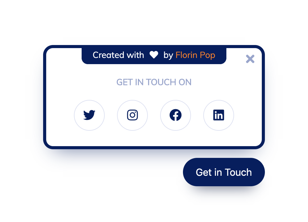
You can see the live version on Codepen:
https://codepen.io/FlorinPop17/pen/LYPrmqV
In this article we’re going to build it from scratch using HTML/CSS and a little bit of JavaScript.
The HTML
There are two important pieces of the HTML.
- The ‘Get in Touch’
buttonwhich will trigger the action that’ll show the Panel - The actual Panel
<div class="social-panel-container">
    <div class="social-panel">
        <p>
            Created with <i class="fa fa-heart"></i> by
            <a target="_blank" href="https://florin-pop.com">Florin Pop</a>
        </p>
        <button class="close-btn"><i class="fas fa-times"></i></button>
        <h4>Get in touch on</h4>
        <ul>
            <li>
                <a href="https://twitter.com/florinpop17" target="_blank">
                    <i class="fab fa-twitter"></i>
                </a>
            </li>
            <li>
                <a href="https://instagram.com/florinpop17" target="_blank">
                    <i class="fab fa-instagram"></i>
                </a>
            </li>
            <li>
                <a href="https://facebook.com/florinpop17" target="_blank">
                    <i class="fab fa-facebook"></i>
                </a>
            </li>
            <li>
                <a href="https://linkedin.com/in/florinpop17" target="_blank">
                    <i class="fab fa-linkedin"></i>
                </a>
            </li>
        </ul>
    </div>
</div>
<button class="floating-btn">Get in Touch</button>
Both the button and the container will be fixed positioned as we want them always to be in the bottom right corner.
The CSS
Before we start, let’s setup some basic CSS rules:
@import url("https://fonts.googleapis.com/css?family=Muli&display=swap");

* {
    box-sizing: border-box;
}
Great! Now the .social-panel-container:
.social-panel-container {
    position: fixed;
    right: 0;
    bottom: 80px;
    transform: translateX(100%);
    transition: transform 0.4s ease-in-out;
}

.social-panel-container.visible {
    transform: translateX(-10px);
}
As mentioned above, it’s fixed and we’re moving it back into the view by adding the .visible class (Check the JS section below to see how it’s done).
Next, the .social-panel element:
.social-panel {
    border-radius: 16px;
    box-shadow: 0 16px 31px -17px rgba(0, 31, 97, 0.6);
    border: 5px solid #001f61;
    display: flex;
    flex-direction: column;
    justify-content: center;
    align-items: center;
    font-family: "Muli";
    position: relative;
    height: 169px;
    width: 370px;
    max-width: calc(100% - 10px);
}
This is basically the main component you see visually. The above container it’s used to position it fixed on the screen. But you knew that already, right? 😄
Now all the mambo-jumbo that’s inside:
.social-panel button.close-btn {
    border: 0;
    color: #97a5ce;
    cursor: pointer;
    font-size: 20px;
    position: absolute;
    top: 5px;
    right: 5px;
}

.social-panel button.close-btn:focus {
    outline: none;
}

.social-panel p {
    background-color: #001f61;
    border-radius: 0 0 10px 10px;
    color: #fff;
    font-size: 14px;
    line-height: 18px;
    padding: 2px 17px 6px;
    position: absolute;
    top: 0;
    left: 50%;
    margin: 0;
    transform: translateX(-50%);
    text-align: center;
    width: 235px;
}

.social-panel p i {
    margin: 0 5px;
}

.social-panel p a {
    color: #ff7500;
    text-decoration: none;
}

.social-panel h4 {
    color: #97a5ce;
    font-family: "Muli";
    font-size: 14px;
    margin: 20px 0;
    line-height: 18px;
    text-transform: uppercase;
}

.social-panel ul {
    display: flex;
    list-style-type: none;
    padding: 0;
    margin: 0;
}

.social-panel ul li {
    margin: 0 10px;
}

.social-panel ul li a {
    border: 1px solid #dce1f2;
    border-radius: 50%;
    color: #001f61;
    font-size: 20px;
    display: flex;
    justify-content: center;
    align-items: center;
    height: 50px;
    width: 50px;
    text-decoration: none;
}

.social-panel ul li a:hover {
    border-color: #ff6a00;
    box-shadow: 0 9px 12px -9px #ff6a00;
}
Few things to note:
- the
.close-btnand theptag are positioned absolute. This is because we want to place them in a certain position inside the.social-panel - we have a small
:hoverefect on the social icons links - within these links we have icons from FontAwesome
Other than that, it’s pretty straightforward. If there is something you don’t understand, let me know and I’ll be happy to help.
Now for the .floating-btn:
.floating-btn {
    border-radius: 26.5px;
    background-color: #001f61;
    border: 1px solid #001f61;
    box-shadow: 0 16px 22px -17px #03153b;
    color: #fff;
    cursor: pointer;
    font-size: 16px;
    line-height: 20px;
    padding: 12px 20px;
    position: fixed;
    bottom: 20px;
    right: 20px;
    z-index: 999;
}

.floating-btn:hover {
    background-color: #ffffff;
    color: #001f61;
}

.floating-btn:focus {
    outline: none;
}
This button also has a :hover effect which will change it’s appearance - neat, eh? 😉
And lastly some media queries as we want it to be responsive also on mobile devices:
@media screen and (max-width: 480px) {
    .social-panel-container.visible {
        transform: translateX(0px);
    }

    .floating-btn {
        right: 10px;
    }
}
Basically we’re moving these floating elements a little to the right to be in the center of a mobile device.
The JavaScript
Now that we have everything in place, we just need to display the panel by adding the .visible class on it when the user clicks the .floating-btn. Also, the .close-btn will… Let’s see if you guess what it does 😉.
const floating_btn = document.querySelector(".floating-btn");
const close_btn = document.querySelector(".close-btn");
const social_panel_container = document.querySelector(
    ".social-panel-container"
);

floating_btn.addEventListener("click", () => {
    social_panel_container.classList.toggle("visible");
});

close_btn.addEventListener("click", () => {
    social_panel_container.classList.remove("visible");
});
Note that the .floating-btn is actually toggling the .visible class. This is because I’m allowing the user to click the button again in order to hide the panel.
Conclusion
I want to thank @ildiesign again for her wonderful work! Make sure you follow her on Twitter and you’ll be amazed by her wonderful designs!
Happy Coding! 😇