These days I’ve been working on a new page for my website. I wanted to have a Timeline to showcase some of my professional accomplishments over the years.
I did it for a couple of reasons:
- My future self will look back one day and say: “Wow… I remember the day when I did that! How happy I was to achieve that goal!”. Our success is a journey, not a destination and I want to write down every goal that I achieve along the way
- It might attract more clients (we’ll see how this goes 😄)
- In my opinion it is a different kind of portfolio. A unique portfolio, maybe? 😜
Nevertheless… Let’s build something now!
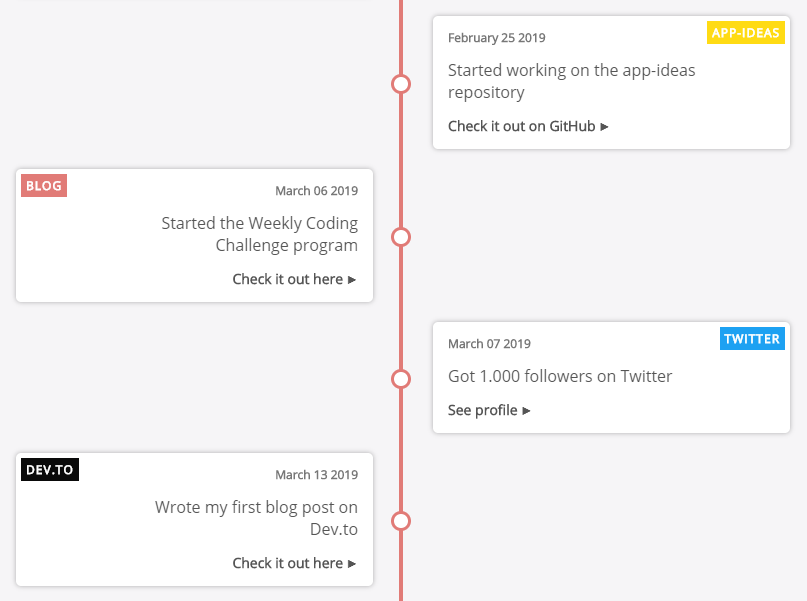
In the picture above you can see what we’re going to build today using React! Before we start let’s break down the steps we need to take:
- Create the
datathat we’ll need - Create the
TimelineItemcomponent - each individual timeline entry - Create a
Timelinecontainer - it will take thedataand pass it down to theTimelineItems - Style everything
Create the data
Before we move to actually create the React components we need to know exactly how the data is going to look so we can plan out the DOM structure.
For this Timeline app we’re going to need an array of objects. We will call this array: timelineData.
Let’s see how it might look:
[
    {
        text: 'Wrote my first blog post ever on Medium',
        date: 'March 03 2017',
        category: {
            tag: 'medium',
            color: '#018f69'
        },
        link: {
            url:
                'https://medium.com/@popflorin1705/javascript-coding-challenge-1-6d9c712963d2',
            text: 'Read more'
        }
    },
    {
        // Another object with data
    }
];
The properties are pretty straightforward, right? I used similar data to what I have on my timeline page, so we can say that this is production ready! 😆
Next, we’ll build the TimelineItem component. This will use the data from the object above:
The TimelineItem component
const TimelineItem = ({ data }) => (
    <div className="timeline-item">
        <div className="timeline-item-content">
            <span className="tag" style={{ background: data.category.color }}>
                {data.category.tag}
            </span>
            <time>{data.date}</time>
            <p>{data.text}</p>
            {data.link && (
                <a
                    href={data.link.url}
                    target="_blank"
                    rel="noopener noreferrer"
                >
                    {data.link.text}
                </a>
            )}
            <span className="circle" />
        </div>
    </div>
);
We have the following tags:
.timeline-itemdiv - used as a wrapper. This div will have half the width of it’s parent’s width (50%) and every other.timeline-itemdiv will be placed to the right side using the:nth-child(odd)selector.timeline-item-contentdiv - another wrapper (more on why we need this in the styling section).tagspan - this tag will have a custom background color depending on the category- the
time/dateand thetext link- we will need to check this to see if alinkis provided because we might not always want to have one.circlespan - this tag will be used to place a circle on the middle line/bar
Note: Everything will make much more sense when we get to the CSS/styling part, but before that let’s create the Timeline component:
The Timeline container
This component will basically map over the array and for each object it will create a TimelineItem component. We also add a small check to make sure that there is at least one element in the array:
import timelineData from '_path_to_file_';

const Timeline = () =>
    timelineData.length > 0 && (
        <div className="timeline-container">
            {timelineData.map((data, idx) => (
                <TimelineItem data={data} key={idx} />
            ))}
        </div>
    );
As mentioned above, the timelineData is the array of objects containing all the required information. In my case I stored this array in a file and I imported it here, but you can take this from your own database or from an API endpoint, it’s up to you.
The CSS
Note that most of the wrappers will be flexbox containers because we can play around easier with their positioning. Let’s start with the .timeline-container CSS:
.timeline-container {
    display: flex;
    flex-direction: column;
    position: relative;
    margin: 40px 0;
}

.timeline-container::after {
    background-color: #e17b77;
    content: '';
    position: absolute;
    left: calc(50% - 2px);
    width: 4px;
    height: 100%;
}
We’re using the ::after selector to create that red line/bar in the middle of the .timeline-container. Using the calc() function we can position the line exactly in the middle by subtracting half of it’s size (2px) from 50%. We need to do this because by default the left property positions it according to the left edge of an element and not the middle.
Now, let’s move to the .timeline-item wrapper.
Below you can see an example of how these are positioned within their parent (the .timeline-container). For demonstration purposes I added a border to highlight these wrappers:
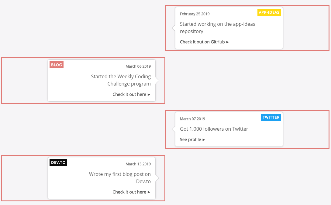
As you can see, every other wrapper goes to the right, and the inner wrapper (the .timeline-item-content) is taking less space - space given by the p tag which is inside it (mostly). Let’s see the CSS for this:
.timeline-item {
    display: flex;
    justify-content: flex-end;
    padding-right: 30px;
    position: relative;
    margin: 10px 0;
    width: 50%;
}

.timeline-item:nth-child(odd) {
    align-self: flex-end;
    justify-content: flex-start;
    padding-left: 30px;
    padding-right: 0;
}
The key to this is that we use the :nth-child(odd) selector and we set the align-self property to flex-end which means: “Go to the right as much as you can”!
Because these wrappers are 50% in width, you can see that two of them take up the whole width. From now on, every time we want to style differently something in the right side, we’ll have to use this approach.
Next, the .timeline-item-content wrapper:
.timeline-item-content {
    box-shadow: 0 0 5px rgba(0, 0, 0, 0.3);
    border-radius: 5px;
    background-color: #fff;
    display: flex;
    flex-direction: column;
    align-items: flex-end;
    padding: 15px;
    position: relative;
    width: 400px;
    max-width: 70%;
    text-align: right;
}

.timeline-item-content::after {
    content: ' ';
    background-color: #fff;
    box-shadow: 1px -1px 1px rgba(0, 0, 0, 0.2);
    position: absolute;
    right: -7.5px;
    top: calc(50% - 7.5px);
    transform: rotate(45deg);
    width: 15px;
    height: 15px;
}

.timeline-item:nth-child(odd) .timeline-item-content {
    text-align: left;
    align-items: flex-start;
}

.timeline-item:nth-child(odd) .timeline-item-content::after {
    right: auto;
    left: -7.5px;
    box-shadow: -1px 1px 1px rgba(0, 0, 0, 0.2);
}
We have a few things going on:
- This wrapper has a fixed
widthand also amax-width. This is because we want it to have some boundaries, meaning that if there are only a few words, we want the box to be at least400pxwide, but if there is a lot of text, it shouldn’t take up the full space (the50%from the.timeline-itemwrapper) but the text should move on to the next line -> this is the reason we used this second wrapper:.timeline-item-content - The
text-alignandalign-itemsproperties are used to push the inner elements to the left or to the right, depending on the parent - The small arrow that points to the middle line is given by the styles applied on the
::afterselector. Basically it is a box with abox-shadowapplied on it that is rotated45deg - As mentioned above, we style the right side by selecting the parent with the
:nth-child(odd)selector
Next up, all the inner elements:
.timeline-item-content .tag {
    color: #fff;
    font-size: 12px;
    font-weight: bold;
    top: 5px;
    left: 5px;
    letter-spacing: 1px;
    padding: 5px;
    position: absolute;
    text-transform: uppercase;
}

.timeline-item:nth-child(odd) .timeline-item-content .tag {
    left: auto;
    right: 5px;
}

.timeline-item-content time {
    color: #777;
    font-size: 12px;
    font-weight: bold;
}

.timeline-item-content p {
    font-size: 16px;
    line-height: 24px;
    margin: 15px 0;
    max-width: 250px;
}

.timeline-item-content a {
    font-size: 14px;
    font-weight: bold;
}

.timeline-item-content a::after {
    content: ' ►';
    font-size: 12px;
}

.timeline-item-content .circle {
    background-color: #fff;
    border: 3px solid #e17b77;
    border-radius: 50%;
    position: absolute;
    top: calc(50% - 10px);
    right: -40px;
    width: 20px;
    height: 20px;
    z-index: 100;
}

.timeline-item:nth-child(odd) .timeline-item-content .circle {
    right: auto;
    left: -40px;
}
Few things to note here:
- As you might have guessed, the
.tagis positionedabsolutebecause we want to keep it in the top left (or right) corner no matter what size is the box - We want to add a small caret after the
atag to highlight that it is a link - We create a
.circleand position it on top of the middle line/bar directly in front of the arrow
We’re almost done! 😄 The only thing that’s left to do is to add the CSS to make everything responsive across all screen sizes:
@media only screen and (max-width: 1023px) {
    .timeline-item-content {
        max-width: 100%;
    }
}

@media only screen and (max-width: 767px) {
    .timeline-item-content,
    .timeline-item:nth-child(odd) .timeline-item-content {
        padding: 15px 10px;
        text-align: center;
        align-items: center;
    }

    .timeline-item-content .tag {
        width: calc(100% - 10px);
        text-align: center;
    }

    .timeline-item-content time {
        margin-top: 20px;
    }

    .timeline-item-content a {
        text-decoration: underline;
    }

    .timeline-item-content a::after {
        display: none;
    }
}
We have two media queries:
- On small laptop screen sizes -
max-width: 1023px- we want to allow the.timeline-item-contentto go across the entire width of it’s parent because the screen is smaller and otherwise it would look squeezed - On phones -
max-width: 767px- set the
.tagto be fullwidth(and for that we don’t need to forget to subtract10pxfrom the total of100%- this is because we have it positioned atleft: 5px, so we remove double of this amount) - center all the text and push it down from the top just a little bit
- remove the caret on the link and add an underline - looks better on mobile 😉
- set the
Aaaand… We’re done!
Conclusion
As I mentioned, this component is on my Timeline page. Check it out to see it in action! 😄
If there is something that you didn’t understand from this article, make sure you contact me and I’ll be happy to answer your questions!
Happy Coding! 😇