In this post we're going to take a look on how to achieve the Floating Label animation with pure CSS. It's been used in MaterializeCSS and it's a clever way to improve the look and feel of your input fields. Read more about it here.
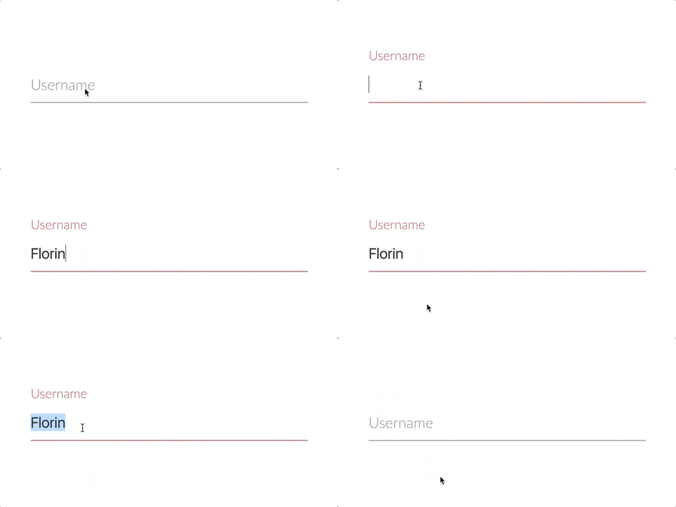
The final result we're going to build will look like this:

As you can see, the label acts like a placeholder, but animates out of the way when the user clicks in the input. It stays there as long as the input is focused or it is not empty. Clever, eh? :D
The process
First, we need the HTML markup. A simple div with an input and a label in it. For now we only use it for one input, but it can be multiplied and changed for any input type (email, password, phone, etc).
<div class="form-group">
	<input type="text" required />
    <label>Username</label>
</div>
Note:
- The
labelmust go after theinputin order to be able to target it with the adjacent selector. - We need to set the
requiredattribute for theinputtag. Why? Because this way we can use the :valid selector to style thelabelaccordingly.
Now for the fun part, the CSS styling!
First we need to set the position of the div to be relative, and the label should be positioned absolute, making it possible to be positioned wherever inside the div.
Note: You can customize it as you wish, I just added some styling to make it look better.
.form-group {
    position: relative;
    padding: 20px 0;
    width: 300px;
    max-width: 100%;
}

.form-group input {
    border: none;
    border-bottom: 1px solid #9e9e9e;
    color: #333;
    display: block;
    font-size: 16px;
    padding: 10px 0;
    width: 100%;
}

.form-group label {
    color: #9e9e9e;
    font-size: 16px;
    font-weight: 100;
    position: absolute;
    top: 0;
    left: 0;
}
We also need to add two more things to the label:
pointer-events: none-> ensures that the label is not clickable.transform: translateY(30px)-> moves it 30px down. It will make it look as it is inside of theinput. (Note that you might need to change this value of 30px depending on the padding you have for the div and input tags).
.form-group label {
    color: #9e9e9e;
    font-size: 16px;
    font-weight: 100;
    position: absolute;
    top: 0;
    left: 0;
    pointer-events: none;
    transform: translateY(30px);
}
Awesome! Everything is in place. All that's left to do is to add the styling when the input is being focused or it's valid (not empty in our case).
.form-group input:valid,
.form-group input:focus {
    border-bottom-color: #ee6e73;
    outline: none;
}

.form-group input:valid + label,
.form-group input:focus + label {
    color: #ee6e73;
    font-size: 14px;
    transform: translateY(0);
}
As you can see, we also changed the color and the font-size. Let's add some transition to make it animate smoothly:
.form-group label {
    transition: all 0.2s ease-in-out;
}
We did it! :D Now you can use the floating label for your next project. It works on mobile too!
Check out this form I've built on Codepen with floating labels.
Happy coding!