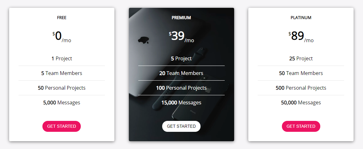
For this post I've decide that I'll teach you how to create a Pricing Plan component as the one shown bellow:
This kind of component is used on most of the SaaS (Software as a Service) presentation websites where people can subscribe for a monthly or yearly subscription. They'll provide multiple choices and you'll pick the one which best suits your needs.
In our example we have 3 plans: Free, Premium and Platinum, but we'll create the component in such a way that you could add more or remove plans. Let's see how it's done! 
The HTML
First, we'll use a flex container which will hold all the .princing-boxes:
<div class="pricing-box-container">
    <div class="pricing-box text-center"></div>

    <div class="pricing-box pricing-box-bg-image text-center"></div>

    <div class="pricing-box text-center"></div>
</div>
Before we move on, you can notice that we have some extra classes:
.text-center- I like adding this helper class which I'll use to center align all the text within the<div>. If you want, you could also add the property directly in the CSS for the div without adding a new class. Most of the CSS frameworks have this class so I'm used to create and use it.
- We have another class for the middle div:
.pricing-box-bg-image- it's obvious from the name, this class will be used to add a nice background image to that div and also it'll help change some things within it (the colors)
Next, let's add the HTML markup. We'll add just for one .pricing-box as they are similar, you can just copy/paste and change the data within afterwards.
<div class="pricing-box text-center">
    <h5>Free</h5>
    <p class="price"><sup>$</sup>0<sub>/mo</sub></p>
    <ul class="features-list">
        <li><strong>1</strong> Project</li>
        <li><strong>5</strong> Team Members</li>
        <li><strong>50</strong> Personal Projects</li>
        <li><strong>5,000</strong> Messages</li>
    </ul>
    <button class="btn-primary">Get Started</button>
</div>
We added a few elements:
- a
headingtext - to display the type of the offer - a
.priceparagraph which displays the price and within the<sup>and<sub>tags we added some aditional information - a
.featured-listthat'll hold all the details of the offer within the list items - a
button- when the user clicks it, we can redirect him to another page, like the checkout page, where he can continue the process of subscribing to the selected plan
The list of items in the offer could be increased simply by adding another <li> tag within the .features-list with the coresponding data.
That's pretty much it for the HTML. Let's move on to the styling. 
The CSS
First we add the general styles. Usually are things like general classes (.text-center in our case), or styling the body tag or importing fonts or adding box-sizing to all the elements. You'll want these in the top of your CSS file.
@import url('https://fonts.googleapis.com/css?family=Open+Sans');

* {
    box-sizing: border-box;
}

body {
    background-color: #f6f5f7;
    font-family: 'Open Sans', sans-serif;
    margin-bottom: 50px;
}

.text-center {
    text-align: center;
}
Next... As I said above, the .pricing-box-container will be a flex item. We'll use flexbox because it will be way easier to arrange the items within the container both vertically and horizontally. It'll also help with the responsive part.
.pricing-box-container {
    display: flex;
    align-items: center;
    justify-content: center;
    flex-wrap: wrap;
}
Using flex-wrap: wrap we're going to make sure that the items will fall on the next line when the viewport width is smaller than the .pricing-box width. Speaking of which, here's the CSS for it:
.pricing-box {
    background-color: #ffffff;
    box-shadow: 0px 2px 15px 0px rgba(0, 0, 0, 0.5);
    border-radius: 4px;
    flex: 1;
    padding: 0 30px 30px;
    margin: 2%;
    min-width: 250px;
    max-width: 350px;
}
Beside the regular css which is simple, I'd like to go over few things:
- The
flex: 1property will stretch all the.pricing-boxes to take up an equal amount space in the container - We set a
marginto have a little space around the boxes - Adding
minandmaxwidth helps maintaining the width within a reasonable range. We don't want it to go wild
Next we'll style all the elements that are within the .pricing-box:
.pricing-box h5 {
    text-transform: uppercase;
}

.price {
    margin: 24px 0;
    font-size: 36px;
    font-weight: 900;
}

.price sub,
.price sup {
    font-size: 16px;
    font-weight: 100;
}

.features-list {
    padding: 0;
    list-style-type: none;
}

.features-list li {
    font-weight: 100;
    padding: 12px 0;
    font-weight: 100;
}

.features-list li:not(:last-of-type) {
    border-bottom: 1px solid rgba(0, 0, 0, 0.1);
}

.btn-primary {
    border-radius: 25px;
    border: none;
    background-color: #ec1362;
    color: #ffffff;
    cursor: pointer;
    padding: 10px 15px;
    margin-top: 20px;
    text-transform: uppercase;
    transition: all 0.1s ease-in-out;
}

.btn-primary:hover {
    box-shadow: 0px 2px 15px 0px rgba(0, 0, 0, 0.5);
    transform: translateY(-3px);
}
There is a longer list of CSS declarations, but don't worry, most of them are pretty basic. Few things are worth explaining:
- When adding the
border-bottomto thelielements, we want to avoid adding the border to the last item in the list. For that we'll combine the:notand:last-of-typeselectors (this is self explanatory: "don't apply this style to the last item within the list which is the same type -li") - To make the button more interactive, we added a little
transitionto it - this will make it go up a tiny bit when hovered and also have a little shadow
We're pretty much done. The only thing left for us to do is to add the .pricing-box-bg-image related styles:
.pricing-box-bg-image {
    background-image: url('https://images.unsplash.com/photo-1550029402-226115b7c579?ixlib=rb-1.2.1&ixid=eyJhcHBfaWQiOjEyMDd9&auto=format&fit=crop&w=701&q=80');
    background-size: cover;
    background-position: center center;
    color: #ffffff;
}

.pricing-box-bg-image .features-list li {
    border-bottom-color: rgba(255, 255, 255, 1);
}

.pricing-box-bg-image .btn-primary {
    background-color: #ffffff;
    color: #000;
}
So... we just added the background-image and made it responsive using background-size: cover. Also we changed the color for the components that are within the .pricing-box-bg-image div in order to make them more visible (light on dark). 
Another one completed!

Conclusion
We built another simple component which you could use in your next freelancing gig! Many employers will need such a component to be added to their website, and now you know how simple it is to create it! You can find the code on Github and see the live version on Codepen.
Let me know what else would you add to this component. I'd be happy to see your additions.
Do you want to see other types of components being created? Complete this google form and I'll be happy to write an article about how I'll craft your idea! 